
UP ROMANIA
Opening Up life experiences


Brand implementation
The visual identity created by opening the Up logo is dynamic and versatile, managing to integrate into all communication needs. The opening Up cube becomes the central element that integrates, shows, covers, discovers, offers and innovates, just like Up products.
The brand is built unitarily from the company to the products and from online to offline, showing dynamism and diversity.


An brand univers based of illustrations
To create a consistent brand personality across all scenarios, we developed a collection of custom illustrations derived from the existing elements and key points of recognition. These illustrations maintain the integrity of shapes, colors, and the overall brand essence, all centered around the unifying symbol of the opening cube.


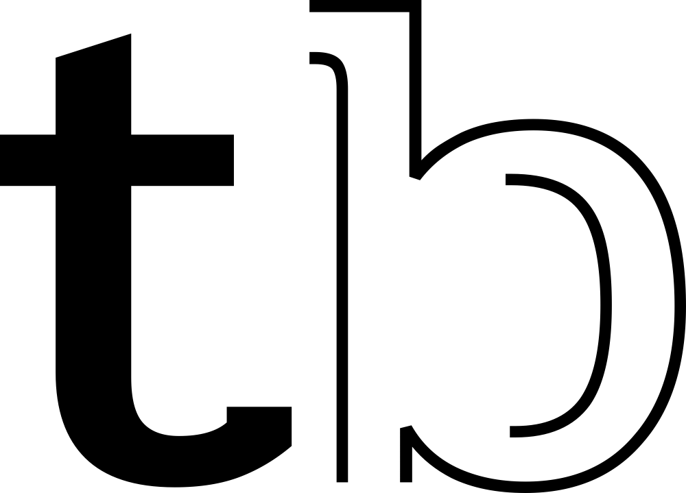
Personality through brand font
The visual universe is completed by a custom brand font. It is modern, simple, and clean, embodying the symbolism of the Up logo through subtle serifs that add a touch of uniqueness and personality to the brand.


Work experiences design
The comprehensive brand implementation also included the design of the office space. We developed a flexible system of elements inspired by the concept of cubes and openness, creating an atmosphere that generates recognition, assistance, motivation, and guidance. The office design aligns seamlessly with the brand’s spirit.
We created room and zone names derived from the core brand, enhancing them with relevant illustrations and brandscapes specific to each area. By designing cubes that are incorporated into walls, hung from above, or divided by glass, we enhanced the office landscape, providing clear directions and visual markers.


