RUN BEAUTY
Revive. Unveil. Naturally.


ABOUT PROJECT
When the name becomes strategy
RUN Beauty partnered with us in a redesign and strategic repositioning process aimed at transforming a brand with strong potential into a coherent, scalable, and memorable system. The starting point was the name itself, RUN, a dynamic word charged with energy and rhythm, which naturally led to the positioning: “Revive. Unveil. Naturally.”
This trilogy defines the brand from three complementary perspectives: performance and revitalization, the enhancement of natural beauty, and respect for clean, vegan formulas developed responsibly. We built a strategic platform designed to support both the current haircare range and future extensions into skincare, body care, and make-up.
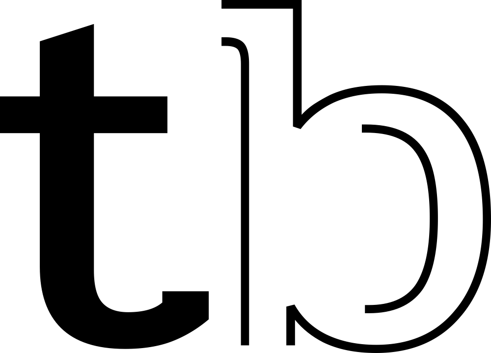
The visual identity was reinterpreted through a fluid wordmark, where the letters R, U, and N merge harmoniously into soft lines that suggest strands of hair, cream textures, and natural movement. The result is a feminine, contemporary, and professional brand — accessible yet refined — built to sustain long-term growth.
SERVICES
Brand Strategy
Brand Architecture
Verbal Identity
Visual Identity
Brand Communication
Packaging
Motion Design


For me, RUN is deeply personal. I’m grateful I worked with a team that truly understood that and built a brand with energy, naturalness, and coherence. Now everything makes sense.
Ella Georgescu | Run Beauty Founder
We build brands that win attention on the shelf and loyalty over time.
The architecture of a coherent product range
For the haircare line, we built a unified system grounded in a clear naming strategy, where each product begins with the letter “R,” reinforcing the RUN identity and enhancing memorability. This approach led to distinctive names such as Recoveria, Ruvance, Rivivis, Ruclaris, and Reglacia — each reflecting the core benefit of its formula while maintaining the brand’s fluid, harmonious sound.
Visually, we developed a dedicated color palette for every product, along with a signature pattern derived directly from the shapes and sections of the RUN wordmark. Typographic elements were transformed into graphic textures that express energy, balance, or reconstruction — depending on the product’s function.
The packaging system is clean, modern, and cohesive, positioning the brand within an “affordable luxury” space, professional and credible, yet accessible. Each product works effectively on its own while contributing to a recognizable visual ecosystem on shelf.


Rivivis
The name Rivivis derives from the idea of “revive,” suggesting intense revitalization and reactivated energy. It is the product that restores strength to weakened hair, working at both root level and along the hair fiber to improve density and resilience. The red color expresses recovery energy, vitality, and the dynamism inherent in the RUN positioning. The graphic pattern, derived from the lines of the RUN wordmark, visually translates the process of revitalization through an upward, fluid movement that suggests stronger, fuller, more vibrant hair. Rivivis thus becomes the clearest expression of the Revive pillar in its most energetic form.


Ruclaris
The name Ruclaris phonetically combines the ideas of “clear” and “clarity,” suggesting purification and balance. It is the shampoo designed for hair prone to excess oil, formulated to regulate sebum without irritating the scalp. The yellow chosen for its identity expresses freshness, brightness, and the energy of effective cleansing. The pattern, built from flowing lines and clean shapes, suggests the natural movement of light, airy hair while also reinforcing the idea of visual clarity and balance. Ruclaris supports the Naturally direction through intelligent control and a long-lasting feeling of freshness.


Reglacia
The name Reglacia blends the idea of regulation with a “glacial” effect, instantly suggesting a cooling and revitalizing sensation. It is the ice-effect product designed to soothe, refresh, and reactivate the scalp. The ice-blue color conveys freshness, cleanliness, and a controlled cooling experience. The visual pattern is built from more compact shapes with sharp edges, inspired by the structure of ice, expressing unity, stability, and intensity. Reglacia introduces a distinct sensory dimension to the portfolio and enhances the RUN experience through a refreshing contrast.


Ruvance
The name Ruvance is phonetically constructed to convey advancement, performance, and enhanced efficacy. The intensive recovery ampoule range complements the action of Rivivis products, featuring a more concentrated, almost medical character. The bordeaux palette combined with deep red expresses the strength of the formula and the seriousness of its intervention on the hair structure. The pattern retains the dynamic energy of RUN, but in a more condensed form, suggesting precision and efficiency. Ruvance represents the advanced treatment component of the range, reinforcing the intensive recovery segment.


Ricoveria
The name Ricoveria derives from the idea of “recovery” and regeneration, defining a complete hair reconstruction system. It is not a standalone product, but a set designed to work as a unified solution, with each element supporting and enhancing the others. The orange chosen for its identity expresses warmth, regenerative energy, and the optimism of the repair process. The pattern is composed of interlocking and complementary shapes, suggesting unity and synergy within the set. Ricoveria thus becomes the clearest expression of system architecture within the RUN product range.


Energy, naturalness, and coherence in communication
Extending the identity into communication meant preserving the dynamism and naturalness defined at a strategic level. The verbal language is energetic yet balanced, feminine without becoming fragile, and professional without feeling rigid. Messaging is built around the three positioning pillars, revitalization, unveiling authentic beauty, and clean formulas — ensuring coherence between product, packaging, and overall brand experience.
The visual identity is flexible and adaptable across digital platforms, promotional materials, and physical touchpoints, maintaining the fluid lines and typographic expressiveness at its core. Through this process, RUN Beauty evolves into a contemporary, scalable, and distinctive brand — built to grow and to foster an authentic connection with active women, always on the run.


