
STOKED
Digital and people mosaic

ABOUT THE PROJECT
Digital human trace
Stoked is a Danish agency trusted by leading companies to solve critical business challenges through digital products that deliver measurable results. Our task with their rebrand was to make that impact visible—and human.
Stoked looks beyond the immediate project to the broader market impact their clients create. They value relationships and the day-to-day joy of working well together. They enable digital change by aligning the right pieces and engaging the right people.
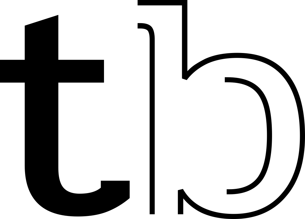
Working closely with Stoked’s global team, we defined a new brand focus: the team itself—a mosaic of people from around the world, united by curiosity, rigor, and a drive to build what’s right. From the digital and people mosaic idea, we developed the core concept: the digital human trace—a simple, powerful device built from two dots. The two dots reference both the digital (:) and human (..), expressing technology and people as one idea.
The identity system centers on a custom wordmark in which two letters are consistently constructed using the digital human trace, a subtle signal of the people behind every product and the human judgment that makes each project great. The design platform is modular and scalable, moving from product UI to motion, social, and internal communications—always anchored by the two-dot trace.
LINE OF BUSINESS
Technology
SERVICES
Brand audit
Brand strategy
Brand architecture
Verbal identity
Brand identity
Motion design
Web design


In our partnership with Tomorrow Branding, we embarked on a transformative journey to redefine Stoked’s brand identity, setting a new strategic direction that was crucial for our authentic presence in the market. Tomorrow Branding’s dedication to deeply understanding our mission, values, and needs, combined with their rigorous execution in visual branding, has been instrumental. This collaboration transcends mere aesthetic appeal, aiming for a profound alignment with our business goals.
Hans Lambert Pedersen | Stoked Founder
We help teams worldwide turn complexity into clarity.
Brand design and implementation
We extended the two-dot concept into a playful, precise visual system. The result is a versatile, digital-first identity that carries the concept end-to-end, from pitch decks and case studies to product sites, social assets, and event materials.
Brand story
“At Stoked we truly believe digital is about people. Our formula is simple: we focus on the core, empowering our mosaic of people from around the world to work together in the best workplace for digital innovators, to create digital, evolve digital and think digital, helping ambitious businesses looking for new ways to innovate and win within digital.”


Digital and people font
To encode the concept at typographic level, we crafted two custom typefaces: Stoked Digital and Stoked People. Together, they form the backbone of the system, shaping hierarchy, UI states, and expressive moments, so the brand’s personality is present across every touchpoint, from product to communications.


A brand that transforms into and for the people
Stoked is a remote-first team spread across the world, and the identity adapts to them: each person’s name becomes a logo using the digital human trace. We also created a set of dot-based emojis to bring the brand’s voice into everyday chats. To foster connection at a distance, we designed a Remote Working Survival Kit—practical, branded tools that build engagement and community, wherever people log in from.


